

Black & White
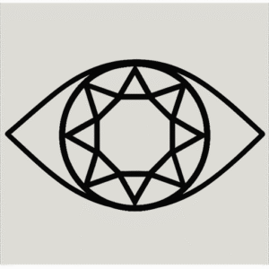
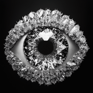
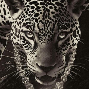
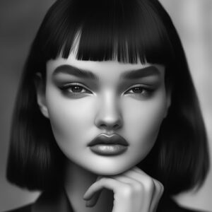
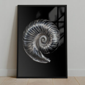
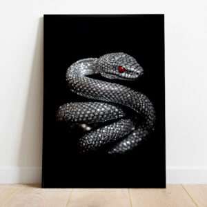
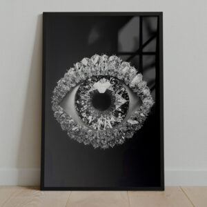
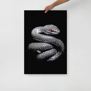
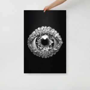
Black and White is the category for people who don’t need color to prove a point. It’s a choice that reads instantly composed, like the room knows what it’s doing.
With the palette stripped back, everything else gets to speak. Light and shadow become the main characters. Lines look sharper. Texture feels richer. The mood lands clean and confident, the visual equivalent of a great blazer or a perfectly timed silence.
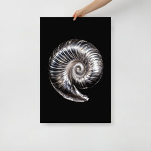
Because it spans photography and illustration, you get range without losing the through line. Photography brings portraits with presence, architectural angles, street moments, and nature scenes that feel quietly cinematic. Illustration adds ink work, graphic compositions, and minimal forms that look intentional from across the room and rewarding up close. It’s cohesive in a way that makes the rest of your space look better by association.
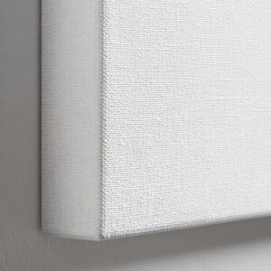
The materials amplify the effect. Posters keep blacks deep and whites crisp with premium matte finishes that avoid glare. Framed prints add warmth and polish, real wood grounds the piece, and the acrylite front keeps contrast sharp as the light shifts through the day. Canvas adds a tactile softness, the raw weave giving extra dimension to shadows and line work. Wall coverings take it immersive, matte, non woven, PVC free, turning a whole wall into a graphic backdrop that still plays nicely with framed art layered on top.
Put Black and White where you want the room to feel more deliberate: an entryway that sets the tone, an office that stays focused, a living room that looks edited, a bedroom that feels calmer without trying too hard. It’s classic, yes. It’s also a subtle flex.
Showing all 6 resultsSorted by latest
Black and White is the category for people who don’t need color to prove a point. It’s a choice that reads instantly composed, like the room knows what it’s doing.
With the palette stripped back, everything else gets to speak. Light and shadow become the main characters. Lines look sharper. Texture feels richer. The mood lands clean and confident, the visual equivalent of a great blazer or a perfectly timed silence.
Because it spans photography and illustration, you get range without losing the through line. Photography brings portraits with presence, architectural angles, street moments, and nature scenes that feel quietly cinematic. Illustration adds ink work, graphic compositions, and minimal forms that look intentional from across the room and rewarding up close. It’s cohesive in a way that makes the rest of your space look better by association.
The materials amplify the effect. Posters keep blacks deep and whites crisp with premium matte finishes that avoid glare. Framed prints add warmth and polish, real wood grounds the piece, and the acrylite front keeps contrast sharp as the light shifts through the day. Canvas adds a tactile softness, the raw weave giving extra dimension to shadows and line work. Wall coverings take it immersive, matte, non woven, PVC free, turning a whole wall into a graphic backdrop that still plays nicely with framed art layered on top.
Put Black and White where you want the room to feel more deliberate: an entryway that sets the tone, an office that stays focused, a living room that looks edited, a bedroom that feels calmer without trying too hard. It’s classic, yes. It’s also a subtle flex.