Choosing wall art for your living room without overthinking
Your living room wall is not a personality test, even if it sometimes feels like one. Let’s pick art that actually works with your space, and still looks like you meant it.
Choosing wall art for your living room is one part taste, one part math, and one part trying not to buy something just because it looked good on someone else’s perfectly lit internet wall. The goal is not to prove you are interesting. The goal is to make the room feel finished, lived in, and steady, like it knows what it is doing.
I’ll tell you the slightly inconvenient truth: most living rooms do not need more decor. They need better decisions. Art can be that decision, because it controls where the eye lands, how long it stays, and whether the whole room feels intentional or vaguely temporary.
So here is a practical, slightly cheeky way to choose wall art for your living room. We will talk scale, color, subject, placement, and the one thing nobody wants to admit: sometimes the wall is empty because you have not picked the sofa yet.
Start with the wall, not the vibe
You can absolutely choose art based on feeling. You should. But start with the physical facts first, because walls are not impressed by your feelings.
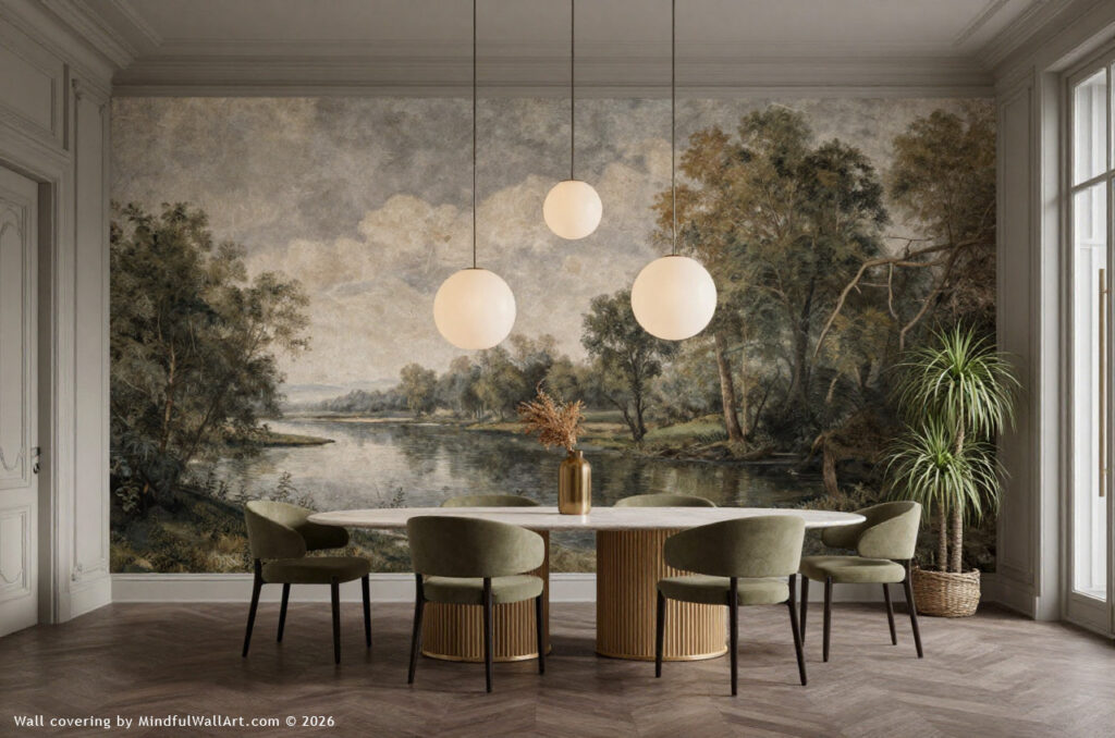
Measure the real rectangle you are decorating
Pick the wall you care about most. Usually it is the wall above the sofa, above a console, or the fireplace wall.
Now measure:
- The width of the furniture under it
- The width of the open wall area around it
- The ceiling height
- Any obstacles like sconces, windows, vents, or that thermostat placed by someone who clearly hated beauty
A helpful rule many stylists use is to aim for art that spans about two thirds to three quarters of the width of the sofa or console under it. This is how you avoid the classic look of a tiny frame floating above a large sofa like it got lost on the way to a hallway.
Decide: one hero piece or a group
There are only a few layouts that reliably work in a living room.
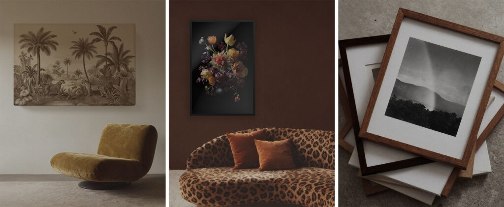
A single large piece
This is the cleanest solution and usually the fastest way to make the room feel grown up. It also prevents the situation where you keep adding frames because the wall still feels empty, and eventually you have built a collage of panic.
A pair or trio
Two or three pieces can feel calm and structured, especially if they share a palette or framing style. This is great when you want impact without one huge image dominating the room.
A gallery wall
This is a commitment. It can look collected and personal, or it can look like you printed a mood board and then lost control. The difference is spacing, alignment, and a plan you follow even when you get excited.
If you go gallery wall, keep spacing consistent. One common guideline is about 5 to 8 cm between frames.
Spacing is boring, which is why it works.
Art gallery or print shop? When your living room needs a statement, not a strategy
Some living room art is bought the way people buy assets: with an eye on the artist’s track record, scarcity, provenance, and the long game. That approach can be deeply rewarding, but it is also why gallery pricing looks the way it does. You are not just choosing an image you like. You are stepping into a market, with research, timing, and often expert advice in the mix.
Before you go that route, it helps to pause for a couple of gentler questions:
Are you excited to learn the story behind the work and the artist, or mainly excited to see something beautiful on the wall this month?
Would you feel comfortable asking a gallery or an advisor the unglamorous questions about edition size, documentation, condition, and resale expectations?
And if the future value stayed flat, would you still love living with the piece every day?
On the other extreme, there is fast decor printing that is made to be easy. It can solve a blank wall quickly, but it often asks nothing of you and gives very little back. The room gets filled, not finished.
But some living rooms thrive in the middle lane: art that is chosen for meaning, atmosphere, and daily enjoyment, without requiring you to treat your sofa wall like a financial decision. You can choose work that feels personal and visually strong, avoid the random filler pieces, and still keep your budget intact. The statement is the point. The investment strategy is optional.
Scale and placement: the reason rooms look off
People blame “style” when the real problem is proportion. The room feels awkward because the art is the wrong size or hung at the wrong height, not because you chose abstract instead of photography.
Hang it closer to the furniture than you think
Art above a sofa should not hover near the ceiling like it is trying to avoid conversation. A practical rule that pops up often is to hang the bottom of the frame about one hand’s width above the sofa.
That distance connects the art to the furniture, so the whole arrangement reads as one intentional zone.
Use the room’s sight lines
Stand in the doorway. Sit on the sofa. Look from the dining table if your layout is open plan. Your art should make sense from the places you actually exist, not just from directly in front of the wall.
Go bigger than your nerves want
Living rooms can handle larger art than bedrooms and hallways. If your wall is broad and your furniture is substantial, a larger piece often looks more natural and less fussy. Minted’s guidance leans into this, noting the living room is a strong place for large statement sizes, while smaller works often need grouping to hold their own.
If you are stuck between medium and large, pick large. Medium is where doubt goes to breed.
Color without matching like a themed outfit
The easiest way to make art work in a living room is not matching the art to the couch exactly. That can look like you bought the room as a set, which is a choice. But it is a very specific choice.
Instead, use one of these approaches.
Option one: echo one color already in the room
Pull a single color from your rug, pillows, or a favorite chair. The art does not need to be that color everywhere. It just needs a recurring note that ties it in.
Option two: add the color the room is missing
If your room is all neutrals, art can supply contrast and energy. If your room is already colorful, art can bring order by repeating a few tones and calming the rest.
Option three: stay neutral, add texture
If you do not want bold color, choose art with texture, depth, or layered tones. Think linen like surfaces, soft gradients, charcoal, ink wash, or photography with strong light and shadow. GoodMood also calls out how lighting interacts with finishes, like matte reducing glare in brighter rooms.
Frame color is part of the palette
Frames are not an afterthought. They are a visible border that can either anchor the work or make it feel disconnected.
A few reliable frame choices:
- Black for graphic contrast and structure
- Natural wood for warmth and softness
- White for lightness and clean edges
- Mixed frames only if the art is already unified by palette or subject
If you are building a gallery wall, repeating the same frame color is the fastest way to make varied art feel like it belongs together.
Subject matter: what the art actually says in your living room
Art is not just color and size. It is content. And content changes the room’s tone.
Here is a curator’s shortcut: pick a subject that supports how you want the room to behave.
Abstract art: calm structure or bold energy
Abstract art is a workhorse in living rooms because it can shape mood without telling a literal story. Soft abstract forms can make a room feel settled. High contrast geometry can make a room feel sharper and more modern.
This is also the best category for people who want art that plays well with many future furniture changes, because it is less tied to a specific era or theme.
Photography: reality, but edited
Photography brings clarity. A strong landscape photograph can widen a room visually. Black and white photography can add focus and a sense of composition. Street photography can add movement.
The key is picking photography with intentional light. Flat lighting reads like a screen saver. Dramatic light reads like a choice.
Figurative and portrait work: immediate presence
Figures and portraits add human energy fast. They also create the feeling of being observed, which is either delightful or deeply annoying, depending on your relationship with eye contact.
If you want figurative work but fear it will overpower the space, place it where it is not the first thing you see the moment you enter. Let it be discovered after you sit down.
Pattern and graphic work: modern punch
Graphic work and pattern based prints can bring rhythm to a room, especially if the furniture is simple. This is great in spaces that feel a little too safe. You know the kind. Everything beige. Nothing wrong. Nothing happening.
Layout choices that solve common living room problems
Let’s match solutions to typical living room realities.
Small living room
Use fewer pieces, bigger presence. Cluttering the wall with many small frames can make the room feel busy. A single strong piece can simplify the visual field.
If you want multiple pieces, try a vertical stack to draw the eye upward.
Mirrors can also help bounce light and open the space visually.
Large living room
Go oversized or go grouped. Large walls need art with enough scale to hold the room. Oversized art can also help anchor furniture arrangements, which is one reason designers keep pointing back to scale as the real secret.
If you have a big wall and small art, create a gallery wall with a strong central piece to give the arrangement a spine.
Open plan living room
Art can define zones. A bold piece above the sofa helps signal the living room area. Art above a sideboard can create a visual boundary between dining and lounging.
Keep the palette cohesive across the whole open plan space, even if the subjects vary.
Fireplace wall
Vertical art often works well above a fireplace because it follows the lines of the mantel and chimney.
Also consider whether the fireplace is used. Heat and soot are not kind to certain materials.
Timing matters more than you think
Here is the part that saves money and regret.
Many designers recommend choosing and placing artwork after the major furniture and lighting decisions are in place, because the art needs to relate to what is already there.
This does not mean you cannot buy art early. It means you should not lock yourself into a piece that forces compromises everywhere else. Your living room should not become a hostage situation.
If you already have art you love, great. Let it be a reference point. Remember, reference point does not mean dictator.
How to use this at home
Do this in one afternoon, with minimal drama.
- Pick one wall to solve first, usually above the sofa
- Measure sofa width and wall width
- Choose your layout: one large piece, a pair or trio, or a gallery wall
- Set a size target: roughly two thirds to three quarters of the sofa width
- Choose a palette approach: echo a room color, add the missing color, or go neutral with texture
- Decide the subject based on the room’s job: unwind, host, read, talk, watch films
- Hang the art so it relates to the furniture, not the ceiling, with the bottom edge about one hand width above the sofa
Then stop. The room will not reward you for adding more frames out of anxiety.
Choosing wall art for your living room is not about chasing the perfect piece.
It is about creating a relationship between the wall, the furniture, and your everyday life. The best art choice is the one that holds the room together quietly, sorry, calmly, while still giving your eye something real to do.
Start with size and placement. Let color support the space. Pick subject matter that fits how you live. And remember, if you are overthinking it, you are already doing the most human thing possible: trying to make a home feel like yours.
Just measure first. Then be poetic.